Cognitive
Cognitive accessibility covers every user having difficulties to read, write and/or concentrate. He may use ad/image blockers or other noise reducing tools and/or custom styles to overwrite the default styles. According to Dyslexia International more than one out of 10 people and according to the ADHD Institute ~6% of all children and ~3% of all adults have Attention Deficit Disorders. Every aspect of accessibility and especially the cognitive accessibility, improve general usability.
- Users with cognitive disabilities are distracted very fast, have difficulties reading text and might quickly forget what they just read/did.
Headings
Since users with cognitive disabilities are distracted very fast, it is important that the main content’s headline has a distinct visual style that invites the user to look at the main content first.
- Headings should have a different style than normal text or buttons, they should also serve as visual anchors and structuring elements.
- Also, have a look at headings for Visual Accessibility.
Tables
Complex tables often overwhelm users with cognitive disabilities. That is why you should keep your tables as simple as possible. If you have complex data, use several tables instead of one to represent it.
- To reduce confusion: Give each element its own cell. Give table data a different look to table headings.
- Using zebra tables is a good idea for longer tables so that the user does not get lost.
- skip code example to next item
.table-row:nth-child(2n) { background-color: rgba(0, 0, 0, 0.5); } - Also, have a look at tables for Visual Accessibility.
Text / Typography
A somewhat recent study has proven that sans-serif, roman and monospaced fonts have the best readability on screen while italic typefaces decrease the readability. What roman and monospaced fonts have in common is that they usually have letters of larger size and their letters differ strongly from each other; their characters (i.e. b, d, q, p) are not just flipped versions of each other. So it is advised to use sans-serif, roman or monospaced fonts for copy text, that ideally have distinct characters.
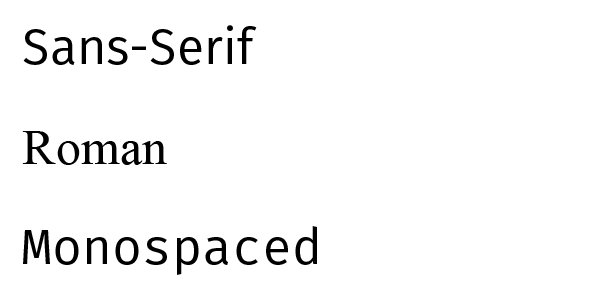
Example of sans-serif, roman and monospaced typefaces. However, roman fonts might also be hard to read. Probably depending on the quality of the screen. You should stick to sans-serif or monospaced fonts for now. - As the user might replace your styles with custom stylesheets, you should avoid using text within images and avoid using
!importantin your css files. - The main text should be aligned on the left (in left-to-right languages). Users with cognitive disabilities have difficulties reading center or right aligned text.
font-sizeshould not be smaller than 12pt and Lines of text not wider than 60-80 characters (helps users that have trouble keeping their place when reading long lines of text).- Justified text should be avoided. Justifications create more inconsistent whitespace which is a real problem for people with dyslexia and a headache for everyone else. In some extreme cases lines seem to move around. Moreover, different browsers treat justifications differently, which gives you no control over your text.
- While sentences should be kept short: 10-15 words, paragraphs can be somewhat longer: Around 5 sentences long is considered easy to read.
- Pure white on pure black will cause text to blur for people with cognitive disabilities. Use off-black text on an off-white background. This website uses
#191919black and#F6F6F6white.
Navigation
The navigation is an important element on a webpage. It helps the users orientate themselves and also to find what they are looking for. That is why all accessibility sections have a Menu / Navigation section. Have a look at: Visual, Low vision & Color and Physical & Audio part for a truly accessible navigation.
- The navigation should not change while navigating the website. It helps the user orientate.
- The navigation should be as simple as possible and clearly indicate the current position (not only with color).
- If there are many items, a vertical menu should be preferred since it is easier to read one item a time. Often the main navigation is horizontal and the secondary vertical. Make sure, that the space between the links is high enough.
- Vertical menus are usually positioned left near to the content while horizontal menus usually start on the top left.
- The website should be logically usable with the browsers back and forth buttons.
- Items containing a submenu should be marked in a way that is obvious. I.e. an arrow pointing down. A study has shown that icons placed on the left are understood faster.
- Throughout the whole website, all pages should have elements that are consistent: The overall look and feel, the global navigation and a consistent presentation of information.
- Lastly, clearly indicate the hover/focus state, the items should change so that users know exactly where they are.
- skip code example to next item
.interactive-element {
  color: blue;
  text-decoration: underline;
}

.interactive-element:hover,
.interactive-element:focus {
  color: deepskyblue;
  text-decoration-style: double;
}
In-page navigation
It is a good practice for longer text to have some kind of table of content. It helps the users to orientate themselves, quickly find the content they seek and to be able to socially share the exact part of the website.
- If possible, give a visual clue that there are anchor-points. I.e. on this website they are indicated with the anchor symbols, giving the user an easy way to store and share specific parts of the website.
Breadcrumbs
It is a good practice to provide breadcrumbs on websites that have more than one or two levels of navigation.
- Links in a breadcrumb navigation show a trail from the front page to the current page, with a link to every page on the way. Usually separated by arrows. The current page should not be linked and be the last item in the list. Here is how an accessible breadcrumb could look like (as seen on Visual Accessibility)
- skip code example to next item
<nav class="breadcrumb" role="navigation" aria-label="You are here:">
  <a href="#link">Home</a>
  >
  <a href="#link">About Sharks</a>
  >
  <span class="visuallyhidden">Current:</span> Hammerhead Shark Facts.
</nav>
Visual output:
Sitemap & Search
Providing a sitemap is usually a good practice for complex websites. It can help users to understand what the site contains and how content is organized. It should list all links and their relation. A good example, is the WAI Sitemap.
- The possibility to search for content on your website should be available if possible. It helps users to find content and is often more efficient than going through the navigation. The ideal search provides suggestions that allow synonyms and check the spelling. This is how an accessible search-bar could look like (as seen on Visual Accessibility):
- skip code example to next item
<header role="banner">
  <img alt="Google" style="height:70px" src="logo.png">
  <div role="search">
    <input type="search" aria-label="Search">
    <button type="submit">Search</button>
  </div>
</header>
Visual output:
Images & Patterns
Avoid text on patterns, no matter how subtle the pattern is. It makes it more difficult to see the words shape.
- Using images that add value to the content, breaking up long sections and giving visual markers is generally a good idea.
- Adding icons to navigation elements can help dyslexic users as well. They will not have to read text to find what they are looking for.
- Animated images are strongly distracting for everyone. They can be a complete turnoff for people with dyslexia. So, they should be used with care. The best solution is to give your users control over such elements by only playing the animation when requested. For
.gifimages, gifffer is a useful tool that automatically adds a play/pause function. Otherwise, give your animated images enough space from the content so that they can be hidden by scrolling further down. - Remember that complex images can be difficult to understand by many people. So, providing long descriptions, benefits many people and thus is a good practice. However, if it is possible to reduce the image complexity, do it.
- skip code example to next item
<figure role="group">
  <img src="chart.png" alt="Pie chart showing ethnic groups in london, described in detail below."
    longdesc="#chart-longdesc">
  <figcaption id="chart-longdesc">
    <h2>Values</h2>
    <table>
      [...]
    </table>
  </figcaption>
</figure>
Advertisements & Sound
In generally, sound should not play automatically. Give the user the choice to enable/disable sound.
- Advertisements should be static. If they are not, the animation should not loop.
- Add your advertisements in a way that a user can hide them by scrolling up or down (below the fold). Then, the ad should be the only thing on that line.
Forms
Forms play a very important role. That is why you should also have a look at forms for Visual, Low Vision & Color and Physical Accessibility.
- When filling out long forms, consider adding an option to auto save or being able to save the progress. Users might take very long and get distracted often. They might want to finish up another day.
- Consider breaking very long forms in smaller steps. If you do so, indicate the current progress in the
title,headingand add a progress bar or a step indicator to indicate the current position. It is a good idea that the user is able to navigate the different steps. - Provide inline instructions when necessary.
- skip code example to next item
<label id="expLabel" for="expire">Expiration date:</label>
<span>
    <input type="text" name="expire" id="expire" aria-labelledby="expLabel expDesc">
    <span id="expDesc" tabindex="-1">(MM/YYYY)</span>
</span>
Visual output: (MM/YYYY) - Make sure that you have accessible labels as introduced in visual accessibility.
Placeholders
While placeholders are very helpful, they are not replacements for labels. Make sure to clearly differentiate placeholders from user input as users might confuse placeholders with pre-filled input.
- Repeating the labels in your placeholders is redundant. I.e. instead of
email: [email], rather provide an example likeemail: [[email protected]].
Errors
Provide an error/success feedback while typing or on blur (when focus on that particular element is lost). Sometimes a feedback while typing is necessary, but as it might be distracting, consider having a feedback on blur only.
- It has become a standard to add an asterisk (*) to required fields. This asterisk should be explained somewhere. Alternatively, just add the keyword “required”.
- Users should be able to check their own input and correct it if necessary.
- Show errors not only with colors. I.e. add a big border around fields with errors or a check-mark for success and a cross or exclamation mark on errors.
- Have a summary of all errors on top of the page as a list. Explaining the error and ideally linking to the respective fields. This way the errors are not overseen. That there were errors should also be indicated in the page title.
Anti-Spam
Generally avoiding anti-spam increases usability. For every layer of complexity you add to your forms, you might lose users on the way.
- If you use captchas make sure to also provide voice checks. Ideally add an alternative way that the user can still reach his goal, even if the captcha fails. I.e. a special email address for direct contact.
- Simple tests as “write ‘Hello World’ into this field:” are o.k. just make sure not to ask for things a person with disabilities could not answer, i.e. asking for colors.
- Always make sure that your anti spam solutions are usable for everyone. Google did an o.k. job with their newest captcha.
Instructions
Instructions should be kept as clear and as short as possible and available at any time.
- Instructions should be formatted as a list and important information should be highlighted.
- If a website has instructions as a video or image, they should also be written down. Some users have issues with audiovisual content while others find it easier than textual content.
Testing & resources
Found an error or have an addition? Please contribute to this project via github.
- Sadly, no testing tool for cognitive accessibility was found. However, as most of the guidelines to improve cognitive accessibility are the same as general usability guidelines. It is advised to gather information on general usability. Start by looking at the references below.
- References/Resources used to write this page: Accessibility Handbook, Simply Accessible, Nielsen Norman Group, Webaim, WAI Tutorials, uxmovement, usmatters Dyslexia Reading Well, BDA-Tech, Study: good fonts for dyslexia, UX Magazine, viget uxmyths, ux.stackexchange, Reddit.
Open up the web for everyone!
Visual • Low Vision & Color • Physical & Audio • Cognitive
Selling Accessibility