Visual
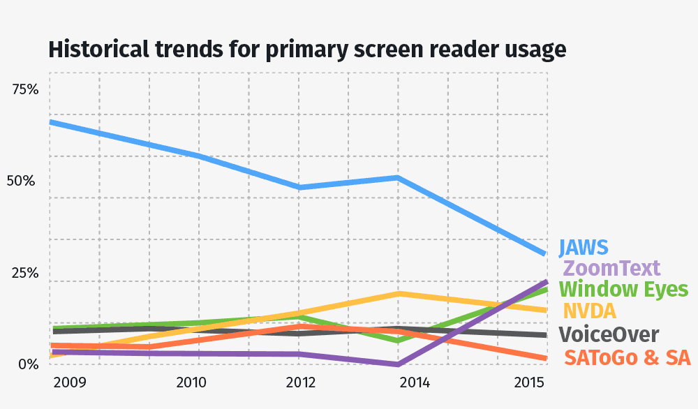
Visual Accessibility covers every user that is using a screen reader. This group encounters the most pain points when surfing the web. According to the NFB more than 7.5 million people in the United States are blind or have a significant vision loss. That is approximately twice the population of Los Angeles. This section focuses on the ones using a screen reader. A screen reader is a tool that reads the content aloud. There are different types of screen readers, the most popular Screen Readers are JAWS and Zoom Text:
- All concepts introduced on this page were tested (so far) with VoiceOver June 2016.
- In example outputs, the headings where replaced by
strongtags and the sections withdivtags to not confuse screen reader users browsing this page.
Basic Facts
- A screen reader can read text, and interpret special attributes written in HTML, most modern screen reader can also list common items as all headers, links, forms and tables.
- The usual pain points are a bad page structure, images, svg, graphs, videos, forms, tables, repetitive elements, visual features, popups.
- Screen readers have no problems using javascript.
Hiding Elements
Accessible websites might need some pieces of information that is only visible to screen reader users and vice-versa. I.e. this page features skip-links that are not visible unless the user needs them (which you can reaveal by tabbing through the page).
- Almost all screen reader obey
display:noneandvisibility:hiddenby ignoring the element. - To have elements visually hidden, but still accessible for screen reader users, the W3C suggests this css method:
- skip code example to next item
.visuallyhidden { border: 0; clip: rect(0 0 0 0); height: 1px; overflow: hidden; padding: 0; position: absolute; width: 1px; } /* note that the margin: -1px as suggested by w3c was removed * because it broke the anchor-jumping possibility on FF * for Physical Accessibility */ - Of course you can also do the contrary. Hide the text from screen readers, but show it visually. By using
aria-hidden="true". The support for aria-hidden is brilliant. - This is how a screen reader would typically interpret the different hiding methods:
- skip code example to next item
I love <span style="display:none;">bees</span> <span class="visuallyhidden">cats</span> <span hidden>and</span> <span aria-hidden="true">you</span>Visual output: I love cats and
Structure
The typical behaviour of screen reader is to read the page from top to bottom. So, it is critical that all your element positioning follows a typical HTML flow. As all modern screen readers use and understand CSS & JavaScript it is important not to mess with the established and logical flow.
- The document outline should be respected. Read more on this in the Headings section. A tool to check your document outline is the html5 outliner.
- Use the
headertag withrole="banner"for the heading of your website (often containing the logo and a search bar). I.e. like this: - skip code example to next item
<header role="banner"> <img alt="Google" style="height:70px" src="logo.png"> <div role="search"> <input type="search" aria-label="Search"> <button type="submit">Search</button> </div> </header>Visual output:
- Any navigation should be contained in a
navtag withrole="navigation". This way some screen reader will be able to list all the navigation elements on your page. Learn more in the Navigation section. - The main content should be in a
maintag withrole="main". A page should always have main section. Screen reader might allow users to jump directly into a pages main section and thus skipping the navigation or headings. - skip code example to next item
<main id="main" aria-label="Content"> <!-- will be read as: 'main, Content, x items' --> </main> - The global footer should be in a
footertag with therole="contentinfo"to differentiate it from other footers on the page. - Any supplementary element (that do not fit in the main tag) belongs in an
asidetag withrole="complementary". - The search bar (with its input, label, button, etc.) should be in a container (can be a form element) with
role="search". Some screen readers allow users to jump directly to the search bar. As seen in the example above. - To group the content of a page you can divide it in sections with the
sectiontag and the genericrole="region". This method was used to group the different sections on this page but not for their subsections: - skip code example to next item
<section role="region" aria-labelledby="SomeTitle"> <h2 id="SomeTitle"> Structure </h2> [...] <div> <h3 id="SomeSubtitle"> Subtitle of Structure </h3> [...] </div> </section>Visual output:Structure [...]Subtitle of Structure [...] - When structuring your element, the best practice is to use the
aria-labelledbyattribute and give it theidof the element’s heading since all modern screen readers can list headings but not sections. If there is no descriptive heading, at least thearia-labelattribute should be used. Let’s demonstrate the different behaviours: - skip code example to next item
<section role="region" aria-label="about"> <h2 id="about">About Sharks</h2> [...] </section> OR <section role="region" aria-label="Shark Fakts"> [...] </section> OR <section role="region"> [...] </section>Visual output:About Sharks [...]OR[...]OR[...] - Use the right tag for the job:
which tag is for what? tag job learn more ol ordered list MDN ul unordered list MDN dl definition list MDN table tabular data MDN blockquote quotes MDN q inline quotes MDN img images MDN em emphasis (italic text) MDN strong bold/highlighted text MDN Few more: abbr address audio base button colgroup datalist del details figure i kbd map mark meter noscript output progress s sub sup track video
Headings
Beside giving a visual clue, screen reader can list all headings. A screen reader user will typically scan a pages headings and then jump immediately to that section. Therefore the logical flow of headings is important. Nest headings accordingly: h1 > h2 > h3 > ... without skipping a level.
- Therefore, it is important to give all your page sections a specific heading with
aria-labelledbyas seen before under Structure. - Wen browsing over a heading, its level is read aloud:
- skip code example to next item
<h6>Example Heading</h6>Visual output: Example Heading - The
role="heading"is not necessary if you use h tags. It might be used to declare other elements as headings withrole="heading" aria-level="7". I.e. to get deeper than h6 - skip code example to next item
<p role="heading" aria-level="9000">wow</p>Visual output:wow
- Write the key information at the beginning.
- skip code example to next item
<!-- DO: --> <li>Great White Shark Facts</li> <li>Hammerhead Shark Facts</li> <!-- DONT: --> <li>Facts about great white sharks</li> <li>Facts about Hammerhead sharks</li> - Usually the first heading is the page name or the overall heading, the second headings indicate the different sections.
- Also have a look at the guidelines regarding headings for people with cognitive disabilities.
Navigation / Menus
As for users with vision the navigation is the most important thing on a webpage. It helps the user orientate himself and also to find what he is looking for. That is why all accessibility sections have a Menu / Navigation section see: Low vision & Color, Physical & Audio and the Cognitive part for a truly accessible navigation.
- Use link-lists to help screen reader announce the number of links a menu has. Generally unordered lists,
ul, are used but when the order matters, as in table of contents, use ordered lists,ol. - Indicate the current page by adding 'Current Page:' in front of the respective element in the menu. Additionally, to make sure that the current page is obvious, the current page should not be linked. See the example below.
- Wrap the menu in a
navtag withrole="navigation"(to support old browsers that do not apply the role implicitly) and a heading to label the menu. This heading can be visually hidden. This is an accessible menu that enables users to find it when listing all the headings or menus: - skip code example to next item
<nav role="navigation" aria-labelledby="menu"> <h2 id="menu" class="visuallyhidden">Main Menu</h2> <ul> <li><span class="visuallyhidden">Current: </span>Home</li> <li><a href="#link">About</a></li> <li><a href="#link">Contact</a></li> </ul> </nav>Visual output:
Drop Downs
Drop downs can be only visually hidden to still be fully accessible for screen readers. Ideally the visuallyhidden class would then be toggled via javascript. See hiding elements. However, if your menu is complex you will have to use some javascript to correctly hide and show your submenus for all users (thus also for the screen reader users since otherwise they would be obliged to traverse everything everytime).
- Usually a drop down is another ordered or unordered list inside the list item of the first ordered or unordered list:
- skip code example to next item
<nav role="navigation" aria-labelledby="exampleNav1"> <h2 id="exampleNav1">Some Example Navigation</h2> <ul> <li><a href="#link">Section1</a></li> <li><a href="#link">Section2</a> <!-- submenu start --> <ul class="visuallyhidden"> <li><a href="#link">Section2-1</a></li> <li><a href="#link">Section2-2</a></li> </ul> <!-- submenu end --> </li> <li><a href="#link">Section3</a></li> </ul> </nav> - Consider having a toggling mechanism hiding/showing elements for screen readers as well, if you have a very complex menu. This might be done by toggling the
aria-hiddenattribute. Here is an example: - skip code example to next item
var menuItems = document.querySelectorAll('.exampleButton'); for(var i = 0; i < menuItems.length; i++) { menuItems[i].addEventListener('click', function(e){ var button = this; var buttonText = button.querySelector('.visuallyhidden'); var subMenu = button.parentNode.querySelector('.example-submenu'); if (!button.classList.contains('open')) { button.classList.add('open'); buttonText.innerText = 'hide submenu'; subMenu.classList.remove('hidden'); subMenu.removeAttribute('aria-hidden'); // sadly, we have to set the focus on the first link element, // otherwise the screen reader does not notice the change (note how the press-button event is not announced) subMenu.querySelector('a').focus(); } else { button.classList.remove('open'); buttonText.innerText = 'show submenu'; subMenu.classList.add('hidden'); subMenu.setAttribute('aria-hidden', 'true'); } }); } - skip code example to next item
<nav id="exampleNav2" role="navigation" aria-labelledby="exampleNav2title"> <h2 id="exampleNav2title">Example Accessible Navigation</h2> <ul> <li><a href="#link">Section1</a></li> <li> <a href="#link">Section2</a> <button class="exampleButton"> <span class="visuallyhidden">show submenu</span> </button> <ul class="example-submenu hidden" aria-hidden="true"> <li><a href="#link">Section2-1</a></li> <li><a href="#link">Section2-2</a></li> </ul> </li> <li><a href="#link">Section3</a></li> </ul> </nav>Visual output:
Breadcrumbs
Breadcrumbs are a great way to contribute to the users overall understanding of a website and they are a great way to improve cognitive accessibility and user experience in general.
- Use a
navtag withrole="navigation"andaria-label="you are here". Also add a visually hidden clue like the word “current” to the last item. - skip code example to next item
<nav class="breadcrumb" role="navigation" aria-label="You are here:"> <a href="#link">Home</a> > <a href="#link">About Sharks</a> > <span class="visuallyhidden">Current:</span> Hammerhead Shark Facts. </nav>Visual output:
Skip Links
Not every screen reader has an advanced mechanism to jump to sections, headings, links, etc. or to skip repetitive blocks of content as tables, code blocks, graphics, etc. So, probably one of the most important things for a good screen reader user experience, is to provide links that allow to jump immediately to relevant sections and/or to skip repetitive content. On this page skip links were added before each code example to skip it. Moreover, visually hidden skip links were added at the beginning of the page, granting screen reader users the possibility to jump directly to either the table of contents, the menu or the content itself. Skip-links is also a best practice for physical accessibility since they have to traverse the whole page as well. You can reveal skip-links on this page by using your keyboard and tabbing through the page.
- Skip links are like normal links pointing to anchors (elements with IDs) on your page. You might want to hide them visually, but should display them on focus to improve the usability of your page for keyboard users as well:
- skip code example to next item
// Script to unhide Skiplinks on focus var skiplinks = document.querySelectorAll('a.visuallyhidden'); for (var i = 0; i < skiplinks.length; i++) { var el = skiplinks[i]; el.addEventListener('focus', function() { el.classList.remove('visuallyhidden'); }); el.addEventListener('blur', function() { el.classList.add('visuallyhidden'); }); } - skip code example to next item
<p>Item</p> <a href="#linkNext" class="visuallyhidden">Jump to wanted position</a> <p>Annoying content</p> <a href="#link">Annoying Link</a> <p id="linkNext">Next item</p> <a href="#link">Wanted Link</p> - Another kind of skip links, this one being visible for everyone, is to have a table of content linking to each heading within a long text. A table of content is nothing other than a navigation menu but with an ordered list.
Tables
Any tabular data should be written in tables as some screen readers have special features to recognize tables. Beside reading this section, have a look at tables for cognitive disabilities.
- It is a good practice to add captions to your tables explaining what they are about. If it is obvious, just hide it for visual users.
- To make sure that the screen readers read your tables correctly, include scoping. Use
scope="col"to identify the columns andscope="row"to identify rows (only placed on the th tag) andscope="colgroup"whenever a column spans over more than one item. This is how a complex accessible table could look like: - skip code example to next item
<table class="exampletable"> <caption>Edible elements:</caption> <tr> <td></td> <th scope="col">Edible</th> <th colspan="2" scope="colgroup">Not Edible</th> <th scope="col">Maybe Edible</th> </tr> <tr> <th scope="row">Apple</th> <td>Fruit</td> <td>Computer</td> <td>Corporation</td> <td>Special</td> </tr> </table>Visual output:Edible elements: Edible Not Edible Maybe Edible Apple Fruit Computer Corporation Special - Avoid using tables for layout purposes; that is not what they are intended for. This is likely to disturb and limit a screen reader’s ability to navigate the page correctly.
- Keep it simple. If you have complex data, use several tables to represent it instead of one.
SVG
Due to responsive web-design, SVG elements are on the rise. Currently SVGs are used to display visual content and thus the guidelines are very similar to those for images, but this will change in near future. Today you can already do way more with SVGs than just displaying images. However, you can still use your SVGs within an
imgtag. Then, regarding screen readers, it is basically the same as any regular image.- If your SVGs are a collection of elements that form an image, you should generally add
role="img"to your container and arole="presentation"to the SVG elements to hide them from the screen reader, as seen in the example below. - If they are not purely decorative elements, usually a
titlewith the respectivearia-labelledby="titleID descID"should be added. Here is an example borrowed from the paciellogroup: - skip code example to next item
<svg xmlns=http://www.w3.org/2000/svg role="img" aria-labelledby="title desc"> <title id="title">Circle</title> <desc id="desc">Large circle with a fat border</desc> <circle role="presentation" cy="60" cx="60" r="35" stroke="black" stroke-width="2" fill="grey" /> </svg>Visual output: - You can use text and links within SVG. For modern screen reader, the
texttag is accessible by default, but you should still add arole="link"to your links: - skip code example to next item
<svg xmlns="http://www.w3.org/2000/svg" width="100" height="30" viewBox="0 0 300 300"> <a xlink:href="#link"> <text x="-300" y="150" font-family="Verdana" font-size="125"> Hello out there </text> </a> </svg>Visual output: - If your SVG contains content that is interactive, you’ll need to make sure that the interactive elements are targetable. That might be done with the
role="link". - Have a look at the purely decorative elements section to find out whether your elements should be hidden or not.
- To learn when and how to add a title & description, see the Alternative Description section.
Images
Images are probably the first thing that one thinks of when thinking accessibility. There are informative images which require good alternative descriptions and then there are purely decorative images that should be hidden from screen reader users as they would only add confusion. It is often difficult to decide which is which. This section covers the semantics, how to implement images, and further down you’ll find information on alternative descriptions.
- If your image provides information and is not purely decorative provide it with an alternative description like so:
- skip code example to next item
<img src="img.jpg" alt="Dog with a bell attached to its collar" style="height: 50px;">Visual output:
- To provide textual information to any reader, you can add a
captionto your image. Give it therole="group"to semantically group the caption and image - skip code example to next item
<figure role="group"> <img src="img.jpg" alt="Dog with a bell attached to its collar" style="height: 50px;"> <figcaption>The bell worn by off-duty guide dogs helps the blind owner keep track of the dog’s location.</figcaption> </figure>Visual output:The bell worn by off-duty guide dogs helps the blind owner keep track of the dog’s location. - In some cases the image is purely decorative. If so, you should still provide an alt attribute but leave it empty. Otherwise, some older screen readers will read the image filename instead. To be sure that it does not get read add
aria-hidden="true". - skip code example to next item
<img src="img.jpg" alt="" aria-hidden="true"> - If you use image maps, add alt attributes and make sure not to use any id or name twice on the same document.
- skip code example to next item
<img src="img.jpg" alt="Chairmen of XY Corp" usemap="#Map" style="height:50px;"> <map id="Map" name="Map"> <area alt="Davy Jones" shape="rect" coords="176,14,323,58" href="#link" style="background-color: red;"> <area alt="Harry Brown" shape="rect" coords="6,138,155,182" href="#link" style="background-color: red;"> </map>Visual output:
Alternative description
In the following section it will be explained when and how to label elements based on image examples. But these alternative description guidelines are not limited to just images. Any other visual element on your page can profit from alternative descriptions. The good alternatives sub-section gives you more general information on how to label. Also, have a look at the purely decorative elements sub-section to know when not to label.
- Any element with text should be accessible. So, if there is text in your image, add an
altattribute containing that text. However, nowadays it is possible to style text with css. Thus, textual elements should be real text. For Mathematical Formulas see MathML. - When the element labels other information, add an alt attribute with the respective information:
- skip code example to next item
<img src="phone.png" alt="Phone:"> 0123 456 7890 - When your element supplements other information, add an alternative:
- skip code example to next item
<img src="fire-extinguisher-car.jpg" alt="Fire extinguisher in a cars’ trunk."> do not forget to equip you car with a fire extinguisher - Instructions should be accessible:
- skip code example to next item
<img src="instruction.jpg" alt="Turn the biggest knob ontop of your ghetto blaster to the right to increase volume and to the left to decrease volume"> - If your elements convey clear impressions or emotions it might make sense to provide them for everyone:
- skip code example to next item
<img src="children-play-area.jpg" alt="we’re family friendly"> - If your element indicates information as the format of a file, write it down as well:
- skip code example to next item
<a href="#link"> <img src="pdf.png" alt="PDF:"> Download ticket </a> - In general, do not describe your logos in detail (no matter how cool they are), the brand’s name and maybe the claim is sufficient.
- If your element conveys further information within a link, that information should be accessible for everyone:
- skip code example to next item
<a href="#link" target="_blank"> Google <img src="new-window.png" alt="open in new window"> </a> <!-- svg --> <a href="#link" target="_blank"> Google <svg xmlns=http://www.w3.org/2000/svg role="img" aria-labelledby="title"> <title id="title">open in new window</title> <circle role="presentation" cy="60" cx="60" r="35" stroke="black" stroke-width="2" fill="grey" /> </svg> </a> - If your graphical elements have a functional value, it is important to convey that same value to everyone:
- skip code example to next item
<a href="javascript:print()"> <img src="print.png" alt="Print this page"> </a> <!-- instead of alt="Printer" --> - For more complex images you will need a two-part alternative. The first part is a brief description to identify the image, the second part is a long description near the visual element as text or as an external link pointing to a text. Use the
longdesc="#longdesc"attribute to link to the long description andaria-describedby="longdesc"if the long description is not directly adjacent. Using the longdesc alone is not a good idea since it lacks support and it leaves out visual users. See the SVG example for SVGs. - skip code example to next item
<figure role="group"> <img src="chart.png" alt="Pie chart showing ethnic groups in london"> <figcaption> <a href="#link">Ethnic groups (text description of the pie chart)</a> </figcaption> </figure> <!-- or --> <figure role="group"> <img src="chart.png" alt="Pie chart showing ethnic groups in london, described in detail below." longdesc="#chart-longdesc"> <figcaption id="chart-longdesc"> <h2>Values</h2> <table> [...] </table> </figcaption> </figure> - When multiple images convey one information you only have to add a description to the first one.
- skip code example to next item
<img src="star-full.jpg"  alt="1.5 out of 3 stars">
<img src="star-half.jpg"  alt="">
<img src="star-empty.jpg"  alt="">
Good alt-ernatives
do not describe your elements if they are purely decorative. If they are not, follow the guidelines below.
- Aim to put the most important information at the beginning of your sentence.
- skip code example to next item
Green Apples Red Apples Yellow Apples <!-- Instead of --> Apples - Green Apples - Red Apples - Yellow - Add a long description if anything more than a short phrase is needed to describe the element.
- Alternative descriptions are not cryptic messages for specialists, they will be read like every normal text. That is why you should use the same punctuation and write normal sentences in your alternative just as any normal text would be. Also, avoid abbreviations.
- The text has to give the same information as the image. That is, if someone cannot see the image, they should still get the important information.
- Keywords like “image”, “button”, “icon”, or “picture” in the alternative are redundant as they are announced by the screen reader.
- Here are some examples for extensive descriptions (borrowed from 4syllabes):
- skip code example to next item
“Two staff members wearing safety gear, shown working outdoors collecting information on a laptop and mobile phone”, “Eucalypt leaf, Tidbinbilla Nature Reserve, Australian Capital Territory”, “A researcher draws blood from a patient’s arm”, “3 young children, two boys and a girl, play with 2 golden labrador puppies, soon to be trained as seeing eye dogs” - Typically the alternative is not a literal description of the image, but conveys the meaning of the image. Here are some examples from w3 to illustrate this:
- skip code example to next item
> A chart showing sales for October has an short text alternative of "October sales chart". It also has a long description that provides all of the information on the chart. > A search button uses an image of a magnifying glass. The text alternative is "search" and not "magnifying glass". > A picture shows how a knot is tied including arrows showing how the ropes go to make the knot. The text alternative describes how to tie the knot, not what the picture looks like. > A picture shows what a toy looks like from the front. The text alternative describes a front view of the toy. > An animation shows how to change a tire. A short text alternative describes what the animation is about. A long text alternative describes how to change a tire. > The text alternative should be “print this page” rather than “(image of a) printer”, “search” rather than “magnifying lens” or “Example.com home page” rather than “Example.com logo”. - DO NOT write short descriptions, they do not add any value. Do not write anything like this:
- skip code example to next item
“banner”, “news item graphic”, “smiling people”,
“plant”, “open day photo”, “decorative element”,
“funny bread”, “needle”, “kids with toys”,
 etc.
Purely Decorative
Visual elements that do not add any value should not be seen by screen readers. The Web Content Accessibility Guidelines 2.0 defines purely decorative images as: “serving only an aesthetic purpose, providing no information, and having no functionality”
- Do not to add titles, descriptions or anything that could possibly be read. For images, make sure that there is an empty alt attribute without any space characters
alt=""otherwise screen reader might read the filename instead. Just to be sure, add thearia-hidden="true"attribute which is supported by modern screen readers and will hide the element. - Note that traditional methods used to hide elements as
visibility="hidden"ordisplay="none"hide elements for everyone, also for screen readers. If you want to hide elements for users with vision, but keep them available for screen reader users, use the technique described in the Hiding Elements section. If you want to hide elements only for screen reader users and keep them visible for users with vision, use the attributearia-hidden="true". - Elements used as part of the design as borders, ornaments and similar are purely decorative elements and should not be accessible.
- Images and other elements being part of links, mostly to increase the clickable area and provide visual structure are annoying for screen reader users because they add more unnecessary noise, thus should not be accessible.
- When the text alternative is adjacent to the element, the element itself should not be accessible to prevent hearing the same information twice.
- skip code example to next item
<img src="grandmothers.jpg" alt=""> <strong>Grandmothers play an important role in our development:</strong> - Elements used for ambience should generally not be accessible unless that ambience is an important information.
- Elements that convey branding, feelings, moods and anything else that is not related to the content are purely decorative. Face the fact that most users are there for the information and not to check out how cool the branding is. Brand values or messages can be communicated in text, but they require something more creative than a simple description of the content of an image.
- According to Dey Alexanders observations during user-tests: screen reader users, even very experienced ones, sometimes become confused by text alternatives for decorative images. Some might even try to click on images (that are not links) because the text alternative mentioned a word or phrase related to their task.
- Background images, article banners, thumbnails and small elements supporting links are most likely purely decorative.
- The W3C Web Accessibility initiative put up a valuable decision tree that describes how to use the alt attribute of the
imgelement in various situations.
Forms
Use the right types for your fields. As filling out forms has always been one of the most important task on the web, the screen reader support is very good. That being said, forms touch all forms of accessibility, so make sure to check the form guidelines for Low Vision and Colorblind Accessibility, Physical and Audio Accessibility as well as the forms for Cognitive Accessibility.
which type is for what? type="" job learn more range range selectors MDN file file selection MDN color color selection MDN More: button checkbox date datetime-local email hidden image month number password radio reset search submit tel text time url week - Group elements that belong together using
fieldsetandlegendtags. Enhance the support by using thegrouprole andaria-labelledby. - skip code example to next item
<fieldset role="group" aria-labelledby="output"> <legend id="output">Output format</legend> <div> <input type="radio" name="format" id="pdf" value="txt" checked> <label for="pdf">PDF file</label> </div> <div> <input type="radio" name="format" id="png" value="csv"> <label for="png">PNG file</label> </div> </fieldset> - Provide instructions that apply to the form when necessary. For example, indicate any required and optional input, allowable data formats, input format and timing limitations.
- As labels provide valuable context information, they should be added whenever possible. Use
for=""attributes matching the form fields ID. If the context is clear visually you might visually hide the labels or only add anaria-label="Search"attribute. If IDs cannot be provided you might encapsulate the field with its label. - skip code example to next item
<label for="exampleName">Name:</label> <input type="text" name="name" id="exampleName"> <!-- or --> <input type="email" name="email" aria-label="email:"> <!-- or --> <label> Subscribe to newsletter: <input type="checkbox" name="subscribe"> </label>Visual output: - Buttons do not require labels, but if they have no text, they will need a
value=""attribute. Giving your button roles as, i.e.role="button", is a good idea to clarify the buttons purpose.
Errors
Show errors not only with color. Write them out. Adding a text explaining which part was incorrect and why near the label and bundled errors on top (ideally with skip-links to jump to the incorrect form-field) enhances the user experience.
- Use
role="alert"witharia-live="assertive"oraria-live="polite". Assertive will be pushed immediately to the screen reader as soon as the element appears while Polite will wait until the screen reader is done with its current task. Read more on MDN. It is a good practice to add it on the title of your error summaries. - skip code example to next item
<h1 role="alert" aria-live="assertive">3 Errors: [...]</h1> - Also, change the pages title of the page accordingly: “3 Errors –” or “Success –”
Anti Spam
As a general usability rule, try to avoid active anti-spams whenever possible, they often add an unnecessary level of complexity to your forms. However, if needed the following guidelines might be useful.
- If you use captchas make sure to also provide voice checks and add an alternative way to still reach the goal even if the captcha fails. For example, an email address for direct contact.
- Simple tests as “write ‘Hello World’ into this field:” are o.k. just make sure not to ask for things a blind person could not answer, i.e. asking for colors.
- Make sure that your anti spam solutions are usable for everyone. Google did an o.k. job with their newest captcha.
Required Fields
Indicate required fields not only visually. It has become a convention to add an asterisk *, but explain that asterisk somewhere. You can also simply add the keyword “required”. Also, provide inline instructions when necessary.
- Use the
requiredattribute andaria-required="true"on required fields. Note that the screen reader will read required twice (once from the label and once from the aria). - skip code example to next item
<label for="name">Name (required): </label> <input type="text" name="name" id="name" required aria-required="true">Visual output: - Users should be able to check their own input and correct it if the data are important.
- Require the user confirmation for irreversible actions & provide undo mechanisms for reversible actions.
Javascript
A common myth is that screen reader do not support javascript. However, the shiny truth is that they do support javascript. That is great news. Nonetheless, accessibility is not only about screen reader users and there are ~1% of users without javascript for diverse reasons. Ideally build your websites so that they work without javascript and then add a javascript layer on top of it.
- Have accessibility in mind when using javascript. Provide a way to have users be aware of changes triggered via javascript, try to not disable the normal functionalities of the browser and make it device independent. Unfortunately, there is no one-fits-all solution. However, a common mistake is i.e. removing the link href and adding an onclick event that handles the link. A better approach is to keep the default behaviour, but then prevent it with javascript:
- skip code example to next item
var specialLinks = document.getElementsByClassName('specialLink'); for(var i = 0; i < specialLinks.length; i++) { specialLinks[i].addEventListener('click', function(e){ var link = this; // save the clicked link e.preventDefault(); // prevent normal behaviour // do stuff window.location.href = link.getAttribute('href'); // go to target }); } - Another problem is making Ajax requests accessible. They might work fine but since they are asynchronous it is difficult for a screen reader to tell the user what is happening. Webaim.org suggests to give your users full control over dynamical updates such as by activating a link or button. Also, try not to remove the keyboard focus at any given time. The WCAG 2.0 suggests that content updating dynamically for more than 5 seconds must provide the ability to pause, stop, or hide that dynamic content.
- To inform screen reader users about updates/changes (as by ajax requersts), use ARIA live regions or alert roles. In some cases it might make sense to set the focus to the newly updated element.
WAI-ARIA & Roles
WAI-ARIA stands for Web Accessibility Initiative - Accessible Rich Internet Applications. It is a W3C Standard, thus those features should be used even if not announced by screen readers yet. If it is not supported yet, it will be in near future. Moreover, they give screen reader useful semantic information. WAI-ARIA allows interaction with even extremely complex websites declaring certain elements on the page with roles and attributes. It works by adding metadata to the HTML tags. Some of the most important attributes are explained in the following. A full reference is up on W3C for all attributes, roles and landmarks.
Attributes
- aria-busy indicates when an element is loading. I.e. when elements are loaded dynamically aria-busy can be set to true while loading and to false when finished. If there is an error aria-invalid should be set.
- skip code example to next item
<ul aria-busy="true"> <li>Loading...</li> </ul> - aria-controls identifies elements whose contents are controlled by the current element. Similar to the aria-owns attribute which identifies a visual, functional, or contextual parent/child relationship when it cannot be provided in the markup.
- skip code example to next item
<button role="button" aria-controls="amount">Increase amount by 1</button> <p id="amount">1</p> <div aria-owns="child">Parent</div> <div id="child">Child</div> - aria-describedby identifies elements that describe the current element.
- skip code example to next item
<div aria-describedby="#exampleDescription">Strange Thing</div> <p id="exampleDescription">Representing [...]</p> - aria-disabled indicates disabled elements, those should additionally be visually grayed out and the tabindex should be removed. Which is similar to aria-readonly, which also indicates elements where the user cannot change the value, but with readonly the user is still able to navigate to descendants.
- skip code example to next item
<input type="checkbox" aria-disabled="true" disabled>Visual output: - aria-grabbed and aria-dropeffect indicate the state in a drag and drop operation.
aria-grabbed="true"indicates that an element is currently being dragged.aria-grabbed="false"indicates that the element not being dragged but can be. Thearia-dropeffectshould be added to all elements where the currently dragged element can be dropped. It can have multiple values separated by a blank space: copy, move, link, execute, popup. - skip code example to next item
<div aria-grabbed="false">Draggable</div> <div aria-dropeffect="move execute">Target</div> - aria-haspopup indicates that the element has a popup context menu or sub-level menu. A popup is generally a group of items that appear to be on top of the main page content.
- skip code example to next item
<li aria-haspopup="true"> <button role="button">Click me to reach sublevel</button> <ul> <li>Sub Level</li> </ul> </li> - As seen in the hiding elements section aria-hidden hides elements from the screen reader.
- skip code example to next item
<p>This is <span aria-hidden="true">hidden</span>.</p>Visual output:This is .
- aria-invalid announces to screen reader users that the elements have invalid data. I.e. you should add this to any form where the value entered by the user has failed validation.
- skip code example to next item
<input type="text" aria-invalid="true"> <input type="text" aria-invalid="grammar"> <input type="text" aria-invalid="spelling">Visual output: - aria-label is, with aria-labelledby probably the most used WAI-ARIA attribute. It defines a string that labels the current element. Used, for example, in structure, search-fields, breadcrumbs and inputs. If the label is visible in the document you should use aria-labelledby instead.
- skip code example to next item
<input type="email" name="email" aria-label="email:">Visual output: - aria-labelledby is, with aria-label probably the most used WAI-ARIA attributes. It defines an element that labels the current element. Used, for example, in structuring sections, navigations, SVGs and fieldsets. If the label is not visible in the document you should use an aria-label instead.
- skip code example to next item
<section aria-labelledby="example"> <h2 id="example">This is an example.</h2> </section>Visual output:This is an example. - aria-live indicates that an element will be updated. Is used i.e. with the alert role it sets the type of alert. Polite will wait for the screen reader to end its current task and then read the element aloud while assertive reads it out aloud immediately. Note: that it will be read out aloud as soon as its rendered and visible. It is a good practice to use it when fields have errors.
- skip code example to next item
<section aria-labelledby="example"> <h2 id="example">This is an example.</h2> </section> - aria-flowto is used to change the regular flow of a document. (poor support)
- skip code example to next item
<div aria-flowto="second">1</div> <div>3</div> <div id="second">2</div> - aria-autocomplete indicates if completion suggestions are provided.
- skip code example to next item
<textarea aria-autocomplete="inline">The suggestions are provided inline, after the users input.</textarea> <textarea aria-autocomplete="list">A list of choices appears from which the user can choose.</textarea> <textarea aria-autocomplete="both">Both types are provided.</textarea> - aria-expanded indicates if the element is currently collapsed or expanded.
- skip code example to next item
<button aria-expanded="false" role="button">Toggle 1</button> <button aria-expanded="true" role="button">Toggle 2</button>Visual output: - aria-level indicates the level of an element. I.e. to expand the headings further down than level 6.
- skip code example to next item
<p role="heading" aria-level="9000">wow</p>Visual output:wow
- aria-multiline indicates whether a text box accepts multiple lines of input or only a single line. This changes the default behaviour in forms: If set to true the enter button will not submit the form.
- skip code example to next item
<textarea aria-autocomplete="inline">The suggestions are provided inline, after the users input.</textarea> <textarea aria-autocomplete="list">A list of choices appears from which the user can choose.</textarea> <textarea aria-autocomplete="both">Both types are provided.</textarea> - aria-multiselectable indicates that the user may select more than one item from the current selectable descendants. Here is an example by James Craig:
- skip code example to next item
<div role="application"> <h1 id="listlabel">ARIA Multiselectable Listbox Example</h1> <ul id="list0" role="listbox" aria-labelledby="listlabel" aria-activedescendant="list0_item1" aria-multiselectable="true" tabindex="0"> <li id="list0_item0" role="option" aria-selected="false">foo</li> <li id="list0_item1" role="option" aria-selected="false">bar</li> <li id="list0_item2" role="option" aria-selected="false">baz</li> </ul> </div> - aria-orientation is used in scrollbars, separators and sliders to show whether the element and orientation is horizontal or vertical. Example via MDN:
- skip code example to next item
<a href="#" id="handle_zoomSlider" role="slider" aria-orientation="vertical" aria-valuemin="0" aria-valuemax="17" aria-valuenow="14"> <span>11</span> </a> - aria-pressed as for aria-checked and aria-selected does what the name suggest, they indicate whether the element is checked, selected or pressed. They can be set to true, false or mixed. Mixed being a mixed mode value for a tri-state element. However, selected has no mixed value. Usually when using standard HTML elements as buttons the state is identified by default and does not require extra aria attributes. They might make sense if you construct your own elements.
- aria-required indicates that user input is required. As seen under required fields This should be added to any required form-field. do not forget to provide a visual clue as well.
- skip code example to next item
<input type="text" name="name" required aria-required="true">Visual output: - aria-sort indicates whether items in a table or grid are sorted in ascending or descending order. Simplified example of the one from maxdesign:
- skip code example to next item
<table id="exampleTable">
  <thead>
  <tr>
    <th aria-label="Account name: Ascending sort applied, activate to apply a descending sort" aria-sort="ascending" aria-controls="exampleTable" role="columnheader" scope="col" tabindex="0">
      Account name </th>
  </tr>
  </thead>
  <tbody aria-relevant="all" aria-live="polite">
  <tr>
    <td>Personal account</td>
    <td>Main Account</td>
  </tr>
  </tbody>
</table>
Roles
- Here is a convenient list or roles extracted from the W3C Reference in alphabetical order.
which role is for what? role="" job learn more alert A message with important, and usually time-sensitive, information. See related alertdialog and status. W3C alertdialog A type of dialog that contains an alert message, where initial focus goes to an element within the dialog. See related alert and dialog. W3C article A section of a page that consists of a composition that forms an independent part of a document, page, or site. W3C banner A region that contains mostly site-oriented content, rather than page-specific content. W3C button An input that allows for user-triggered actions when clicked or pressed. W3C checkbox A checkable input that has three possible values: true, false, or mixed. W3C columnheader A cell containing header information for a column. W3C combobox A presentation of a select; usually similar to a textbox where users can type ahead to select an option, or type to enter arbitrary text as a new item in the list. W3C command A form of widget that performs an action but does not receive input data. W3C complementary A supporting section of the document, designed to be complementary to the main content at a similar level in the DOM hierarchy, but remains meaningful when separated from the main content. W3C composite A widget that may contain navigable descendants or owned children. W3C contentinfo A large perceivable region that contains information about the parent document. W3C definition A definition of a term or concept. W3C dialog A dialog is an application window that is designed to interrupt the current processing of an application in order to prompt the user to enter information or require a response. W3C directory A list of references to members of a group, such as a static table of contents. W3C form A landmark region that contains a collection of items and objects that, as a whole, combine to create a form. See related search. W3C grid An interactive control which contains cells of tabular data arranged in rows and columns, like a table. Also, see gridcell W3C group A set of user interface objects which are not intended to be included in a page summary or table of contents by assistive technologies. W3C heading A heading for a section of the page. W3C img A container for a collection of elements that form an image. W3C input A generic type of widget that allows user input. W3C landmark A region of the page intended as a navigational landmark. W3C link An interactive reference to an internal or external resource that, when activated, causes the user agent to navigate to that resource. See related button. W3C list A group of non-interactive list items. See related listbox and listitem. W3C log A type of live region where new information is added in meaningful order and old information may disappear. W3C main The main content of a document. W3C marquee A type of live region where non-essential information changes frequently. W3C math Content that represents a mathematical expression. W3C menu A type of widget that offers a list of choices to the user. See related: menuitem, menuitemcheckbox and menuitemradio W3C menubar A presentation of menu that usually remains visible and is usually presented horizontally. Related: menuitem, menuitemcheckbox and menuitemradio W3C navigation A collection of navigational elements (usually links) for navigating the document or related documents. W3C note A section whose content is parenthetic or ancillary to the main content of the resource. W3C option A selectable item in a select list. W3C presentation An element whose implicit native role semantics will not be mapped to the accessibility API. W3C progressbar An element that displays the progress status for tasks that take a long time. W3C radio A checkable input in a group of radio roles, only one of which can be checked at a time. Related: radiogroup. W3C range An input representing a range of values that can be set by the user. W3C region A large perceivable section of a web page or document, that is important enough to be included in a page summary or table of contents, for example, an area of the page containing live sporting event statistics. W3C roletype The base role from which all other roles in this taxonomy inherit. W3C scrollbar A graphical object that controls the scrolling of content within a viewing area, regardless of whether the content is fully displayed within the viewing area. W3C search A landmark region that contains a collection of items and objects that, as a whole, combine to create a search facility. See related form. W3C section A renderable structural containment unit in a document or application. Related: sectionhead. W3C select A form widget that allows the user to make selections from a set of choices. W3C slider A user input where the user selects a value from within a given range. W3C spinbutton A form of range that expects the user to select from among discrete choices. W3C status A container whose content is advisory information for the user but is not important enough to justify an alert, often but not necessarily presented as a status bar. See related alert. W3C structure A document structural element. W3C tab A grouping label providing a mechanism for selecting the tab content that is to be rendered to the user. See related: tablist and tabpanel. W3C timer A type of live region containing a numerical counter which indicates an amount of elapsed time from a start point, or the time remaining until an end point. W3C toolbar A collection of commonly used function buttons or controls represented in compact visual form. W3C tooltip A contextual popup that displays a description for an element. W3C tree A type of list that may contain sub-level nested groups that can be collapsed and expanded. Also, see: treegrid and treeitem. W3C Less common: application document row rowgroup rowheader separator structure textbox widget window
Testing & resources
Found an error or have an addition? Please contribute to this project via github.
- There are some automated testing tools as CynthiaSays and WAVE but because they cannot make judgment calls, they are not as good as human testing. So, the best way to test your website for visual accessibility is to actually use a screen reader yourself. Now, as you do not want to spend thousands of dollars, use the ones you can get for free. On a Mac OS you can use the built in VoiceOver. On a Windows OS there is NVDA, which is backed by users and huge companies like Adobe and Google.
- References/Resources used to write this page:
The Standart: W3.org, MDN, dev.opera, Webaim, WAI Tutorials, Section508.gov, Paciello Group and WCAG 2.0, Web Accessibility Initiative.
Other: Accessibility Handbook, Peter Krantz Blog, 4syllables, Stackoverflow and Reddit. Open up the web for everyone!
Visual • Low Vision & Color • Physical & Audio • Cognitive
Selling Accessibility